Designing Option Chain for faster analysis and order execution
Simplified a fragmented options workflow to reduce the time and friction between finding an opportunity and placing an order.
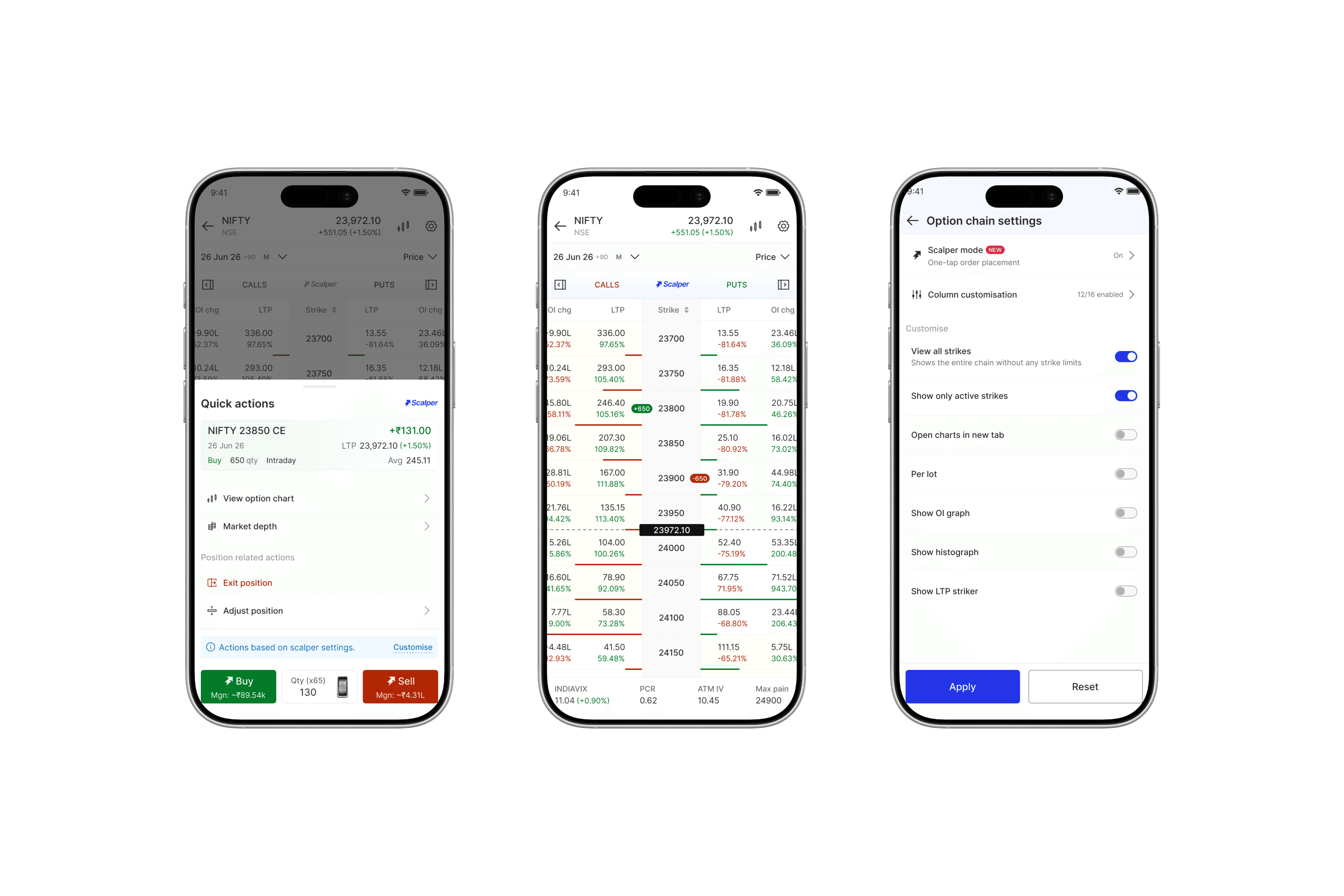
Overview
I led the end-to-end revamp of FYERS’ Option Chain, simplifying how active F&O traders analyse contracts, execute trades, and manage positions.
I focused on reducing friction across the trading workflow, bringing key actions closer to the decision. This reduced order placement time by 45%.
Outcomes
The changes made Option Chain a core part of the trading experience, driving more orders while reducing the effort needed to navigate and trade.
+16%
Orders from Option Chain
45%
Reduction in order placement time
-28%
Less scroll per active session
Role
Owned the design end-to-end, from IA to prototyping, user testing and developer handoff.
Before we dive in
What are options?
Imagine you think NIFTY, India's benchmark stock index, is going to rise.
Instead of buying it outright, you pay a small premium for the right to buy it later at today's price. If the market goes up, that premium can multiply into a much bigger profit. If you're wrong, you only lose the premium you paid.
Why the option chain exists?
Once you've decided to trade an option, the next challenge is deciding which one to buy.
For the same stock, there are hundreds of options across strikes and expiries. Prices change constantly, making it difficult to compare opportunities one by one.
The Option Chain brings every available option into one place, helping traders compare prices, spot patterns, and act quickly without switching screens.

Anatomy of an Option Chain
The Problem
F&O traders need to scan large amounts of market data, make decisions quickly, and act before prices move. But Option Chain fragmented this journey across dense information, multiple steps, and disconnected screens.
Finding the right contract was difficult
Traders had to scan dense data across 40+ strikes, with limited visibility and heavy scrolling. In a fast-moving market, that often meant missing a good opportunity.


Placing a trade took multiple steps
The Option Chain order flow wasn't built for the speed F&O trading demands. 4+ steps delayed order placement, causing traders to miss ideal entry prices.


Multiple steps made the journey slow

Managing positions required switching screens
Once a trade was placed, it didn't appear anywhere on the option chain. Traders had to switch screens to manage positions, making it easy to act on the wrong contract.

Confusion due to lack of position marker




Solution
👀 Redesigned for faster scanning
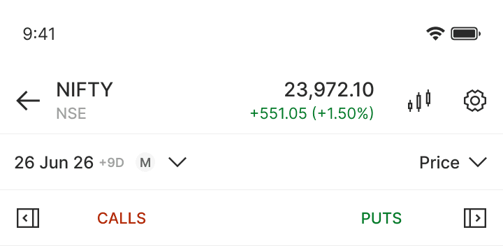
The option chain was redesigned around three improvements. The header was reduced from 203px to 126px — a 38% reduction, making room for three additional rows of contracts.
Key indicators moved from a bottom sheet to 0 clicks, and the color palette was simplified from 9 colors to 6 using lower saturation for better readability and industry alignment.

Before → After


⚡️ Introducing scalper mode for faster execution
Scalper Mode moved stop loss, target, and position sizing into a one-time setup, cutting execution to 2 clicks and 2-3 seconds.

Scalper mode enabling flow

Scalper toggle
Kept Scalper inside Settings as a one-time preference, keeping the Option Chain focused and clutter-free.
Preset order preferences
Moved recurring order preferences into Settings, so traders configure them once instead of repeating them for every trade.
Optmised order flow for default & scalper mode
Since all other configurations were preset, quantity was the only variable. I introduced a compact scroll-wheel field that snaps to the next lot multiple.
I replaced the 1.8s status screen with a non-blocking toast, while retaining all its states without interrupting the trading flow.

Order placement in Scalper mode

Reduced order-time decisions
Pre-configured order settings, leaving quantity as the only decision during execution.
Kept traders in the Option Chain
Displayed positions and order confirmations inline, removing unnecessary screen switches.

The same optimisations were applied to Default mode
Outcomes
For a platform built around core F&O traders, the Option chain is one of its most critical experiences. This revamp helped serve more trading styles and strengthened FYERS' position in advanced trading.
+16%
Orders from Option Chain
45%
Reduction in order placement time
-28%
Less scroll per active session
